
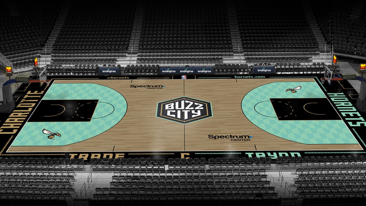
CHARLOTTE, N.C. — The Charlotte Hornets unveiled the new "City Edition" court to be used during the 2020-21 season on Friday.
The court will be used during games at the Spectrum Center in which the team will wear the corresponding City Edition uniforms, which were unveiled earlier this week.
Much like the uniforms, the Hornets say the court will feature a mint, gold, and granite color scheme celebrating Charlotte's history of the first U.S. Branch Mint and the Carolina Gold Rush of the early 1800s, while also incorporating the state rock of North Carolina.
(Credit: Charlotte Hornets)
Highlights of the design include:
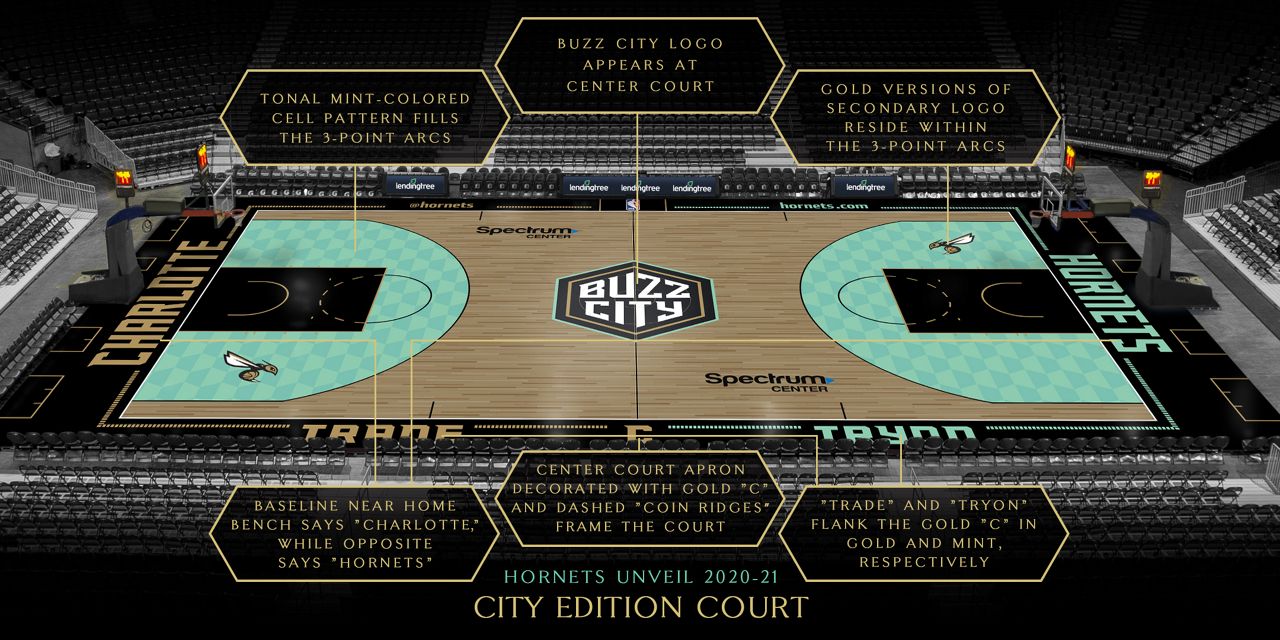
- The court features the “Buzz City” logo at the center outlined in gold and mint
- A tonal mint-colored cell pattern fills the area between the three-point line and free-throw lane
- A gold and graphite version of the secondary logo appears inside the three-point lines
- The free-throw lane is graphite with gold lines
- The court apron is graphite with gold accents on the home time end of the court and mint accents on the visiting team end
- A “coin-ridged” stripe matching the pinstripes on the City Edition uniform runs throughout the apron
- The baseline near the home bench says “Charlotte” in gold and the baseline near the visiting bench says “Hornets” in mint
- The apron has a gold “C” in the official team font at center court, similar to the waistband of the City Edition shorts and reminiscent of the “C” that appeared on coins from the Charlotte Mint
- The gold “C” on the apron is flanked by the word “Trade” in gold across from the home bench and the word “Tryon” in mint across from the visiting team bench, representing Trade and Tryon Streets, the major intersection two blocks away from Spectrum Center at the heart of Uptown Charlotte that divides the area’s four wards
- A pair of Spectrum Center logos continue to live outside the three-point lines
- The Novant Health logo will continue to appear on the apron in front of each bench