

HEALTH
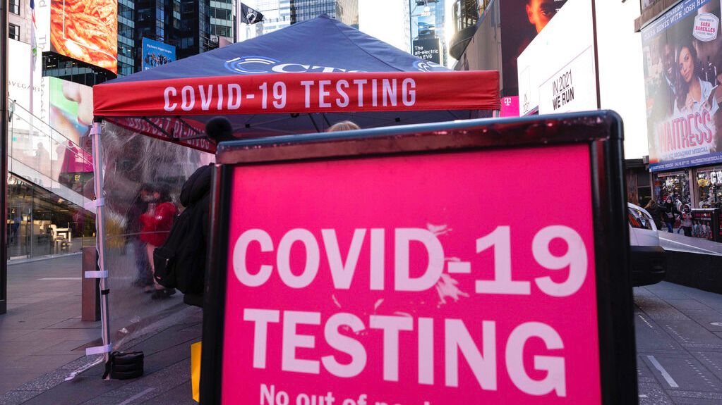
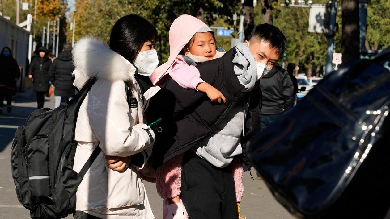
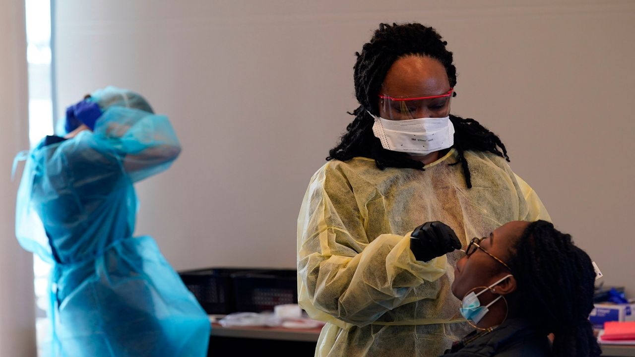
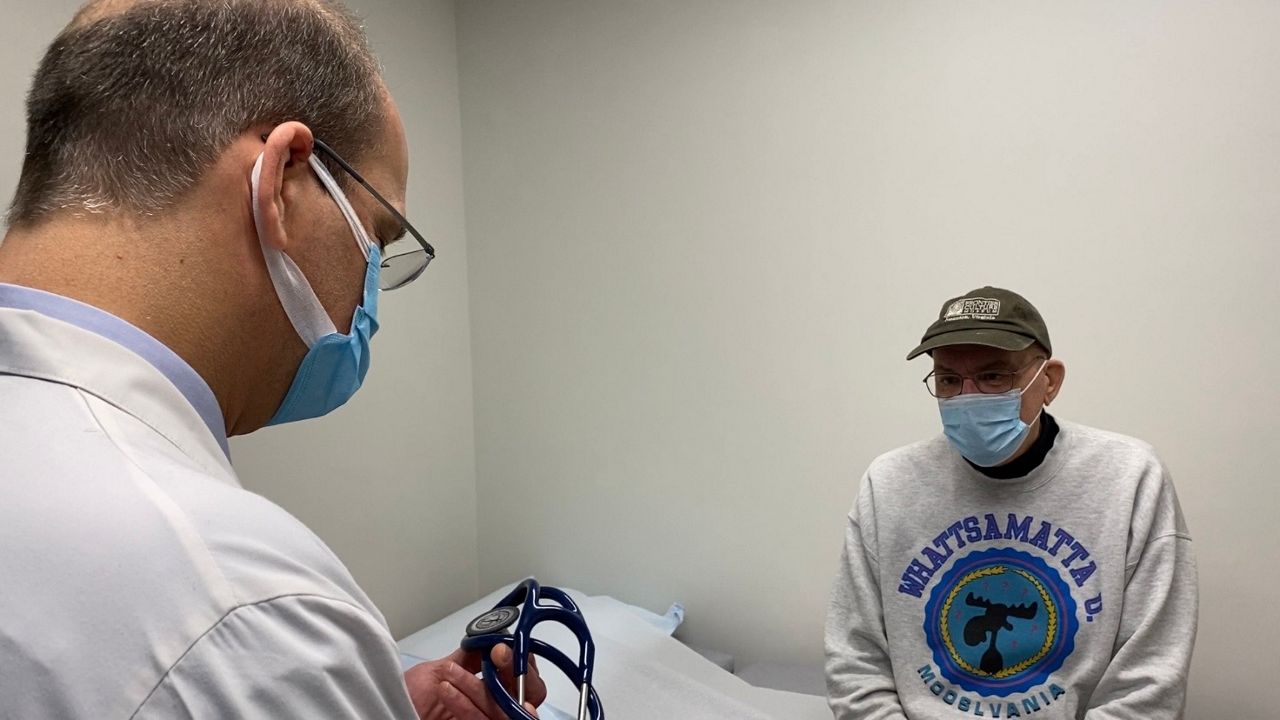
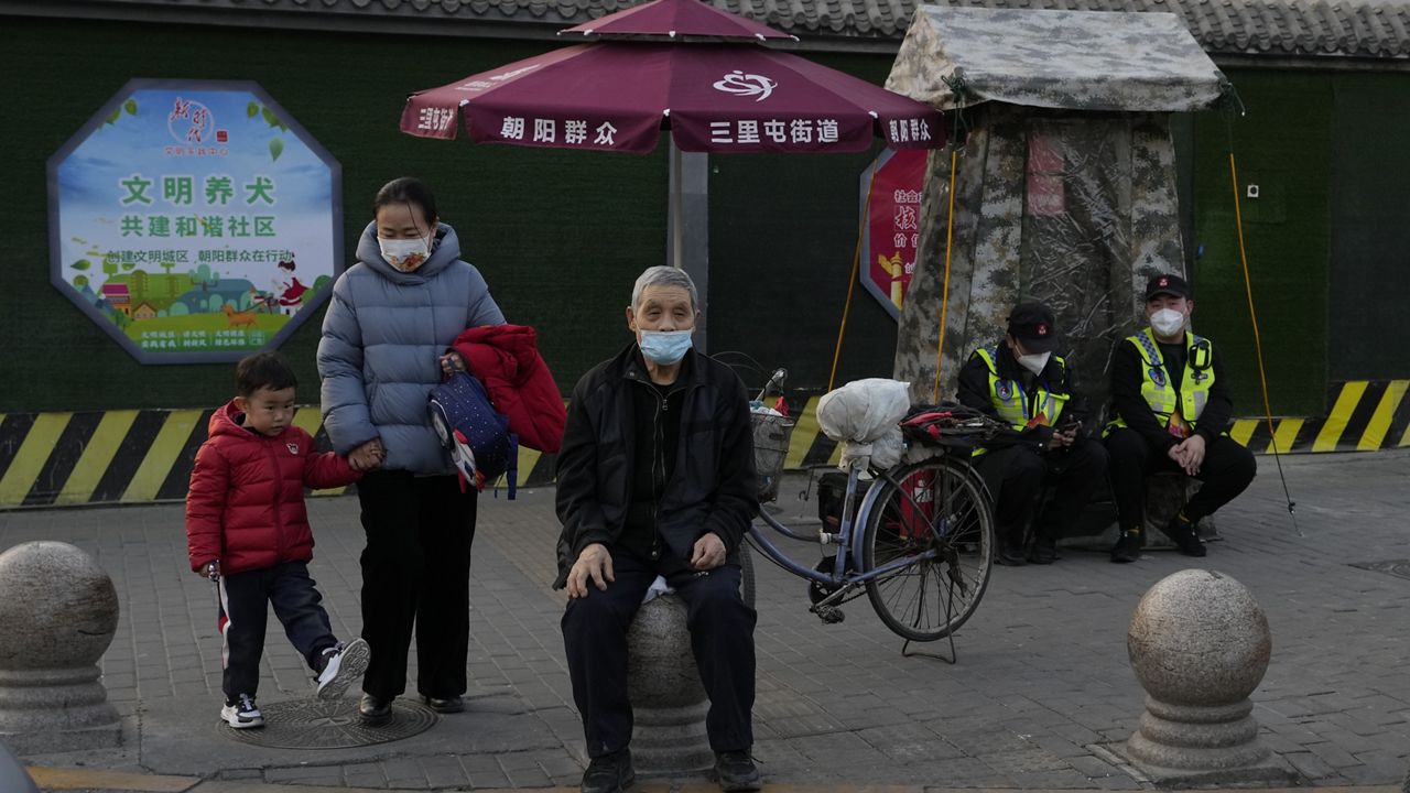
Vulnerable Americans live in the shadow of COVID-19 as most move on
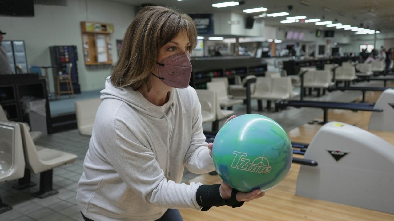
The threat of infection is a governing force in their lives while others speak of the coronavirus in the past tense.
The threat of infection is a governing force in their lives while others speak of the coronavirus in the past tense.
The North Carolina Respiratory Virus Dashboard gives an idea of the current spread of respiratory illnesses, including COVID-19, influenza and RSV.
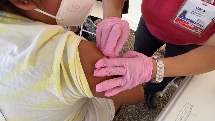
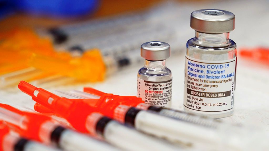
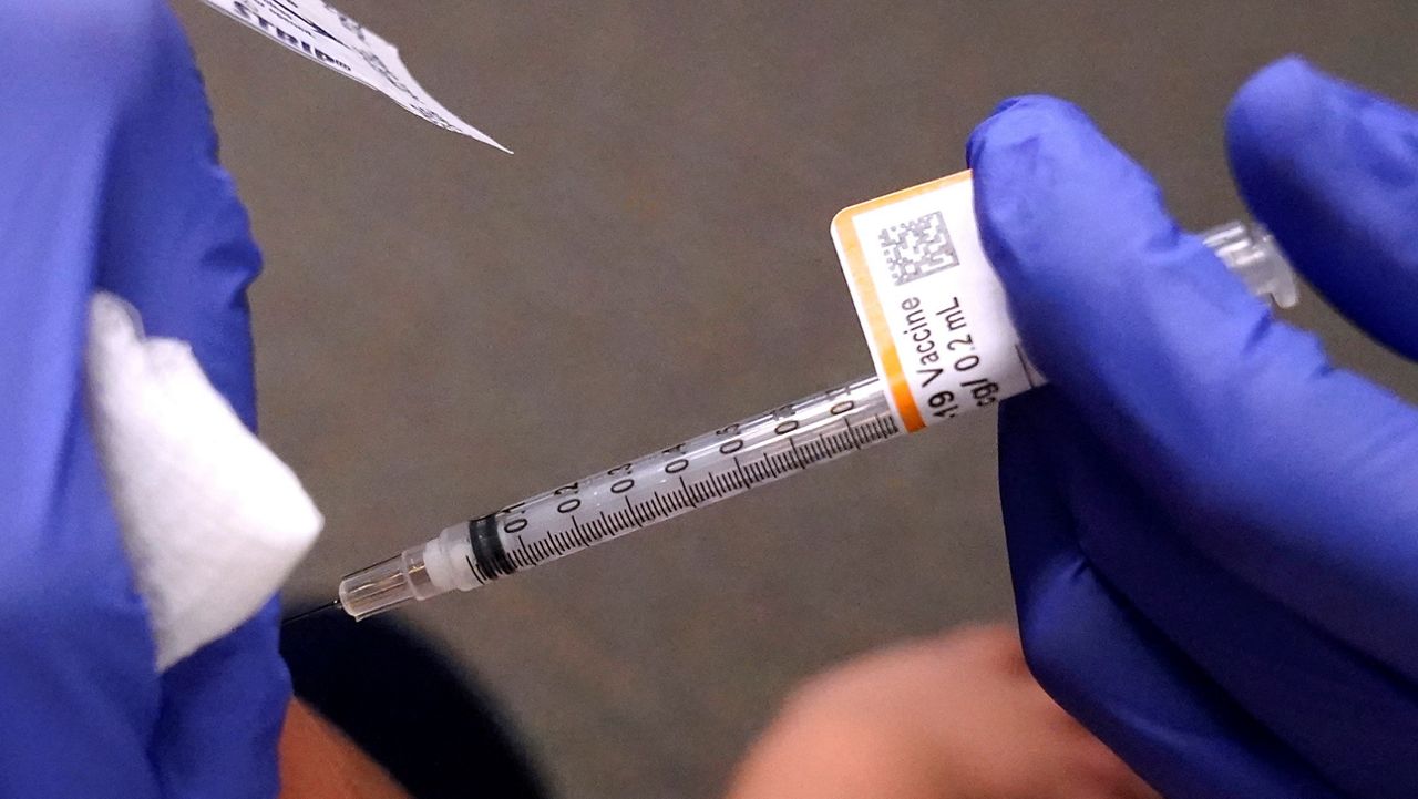
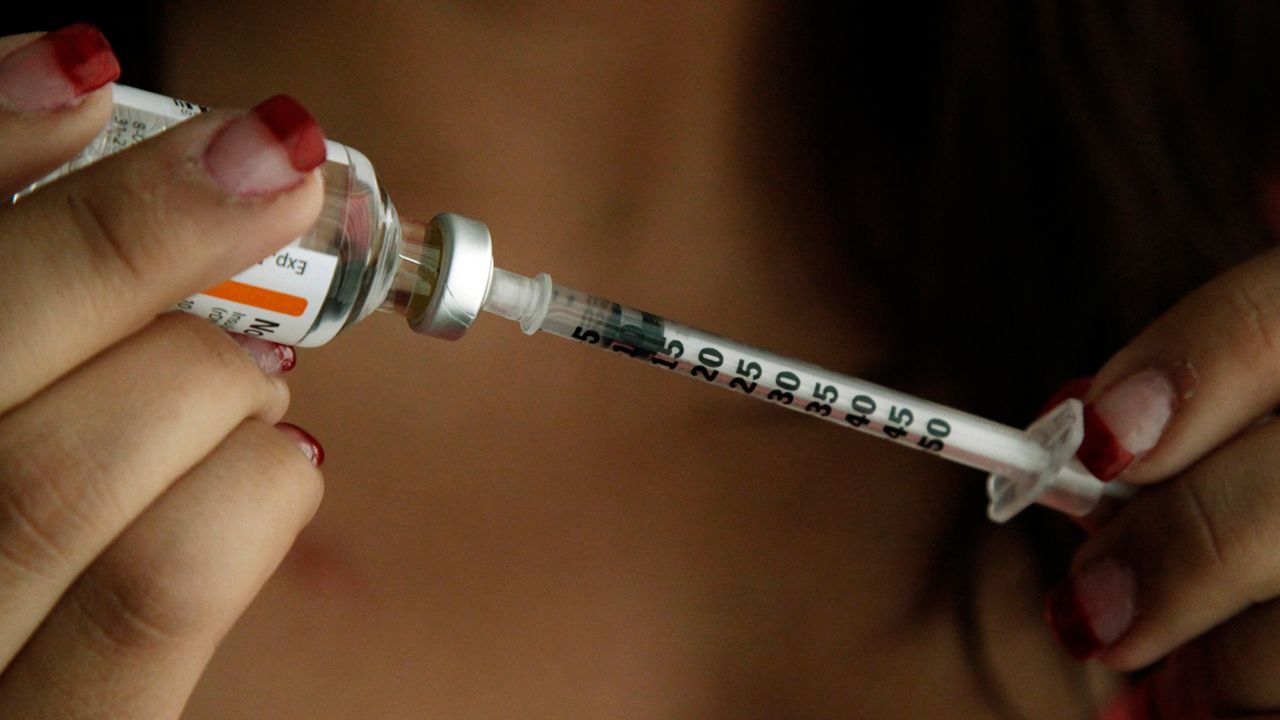
Flu experts suggest everyone get vaccinated, especially as people prepare to attend holiday gatherings where respiratory viruses can spread widely.
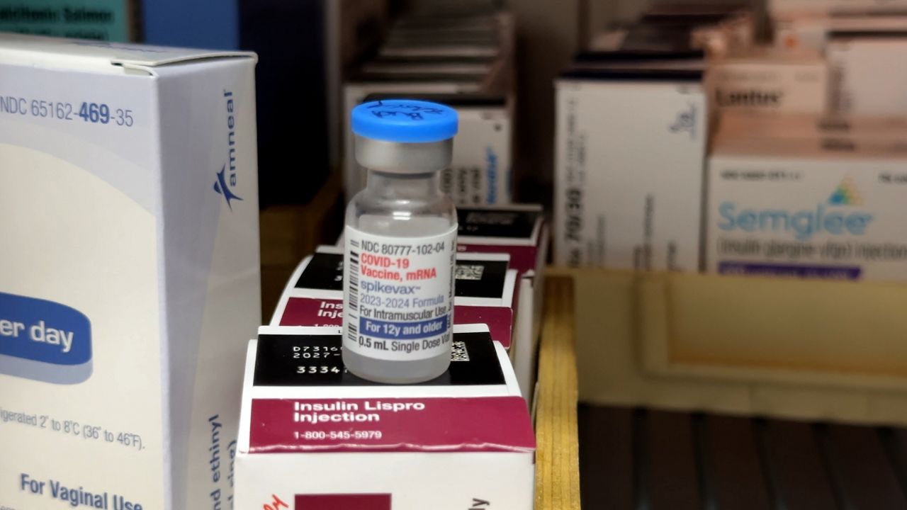
The survey showed just 17.9% of adults over the age of 18 have received a COVID-19 shot this season while 34.7% have received a flu vaccine.
The COVID-19 pandemic led to college athletes being granted an additional year of eligibility. Now the majority of them are in their final season.
Children and teenagers who have COVID are 50% more likely to develop diabetes, per the study.
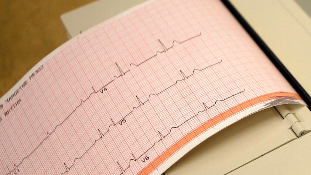
The study was conducted by the Cleveland Clinic and the University of Southern California.
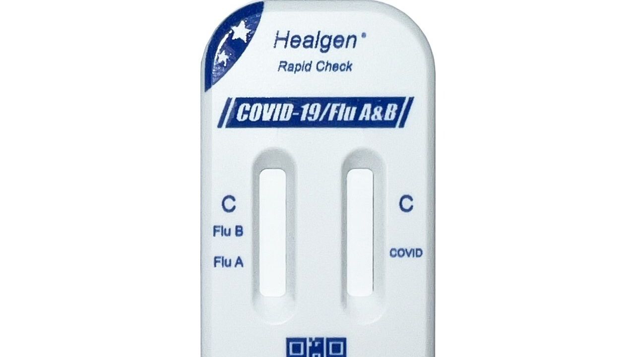
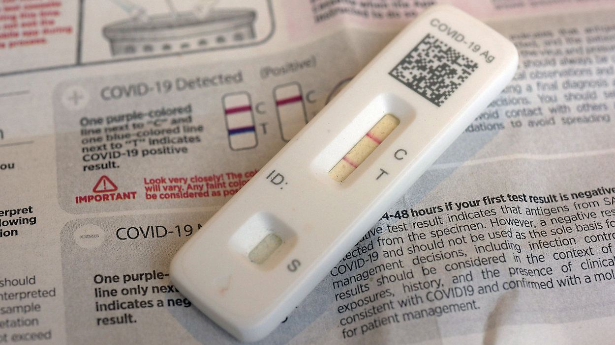
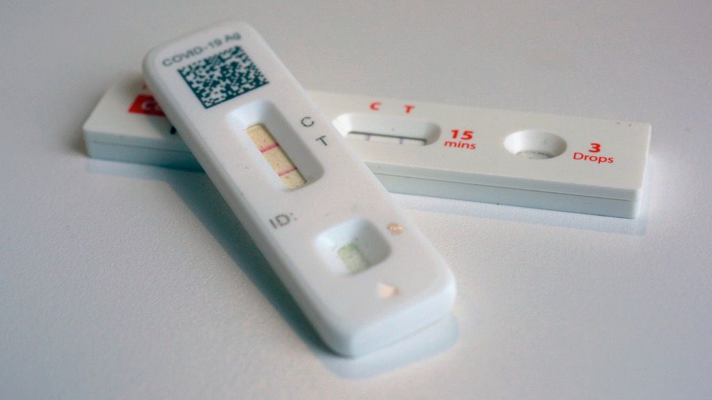
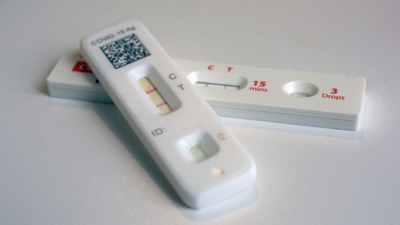
It's the first over-the-counter test capable of detecting COVID-19 and the flu to be marketed without an emergency use declaration.
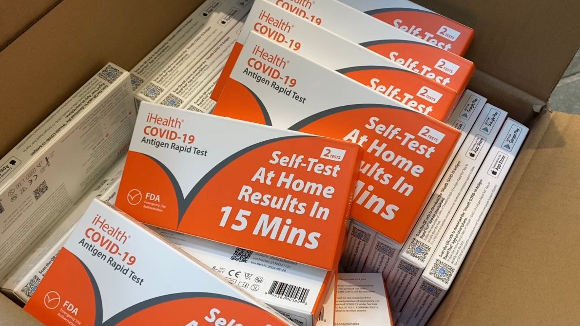
Americans will be able to order up to four COVID-19 nasal swab tests delivered to their home free of charge starting later this month.
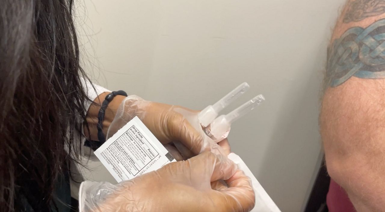
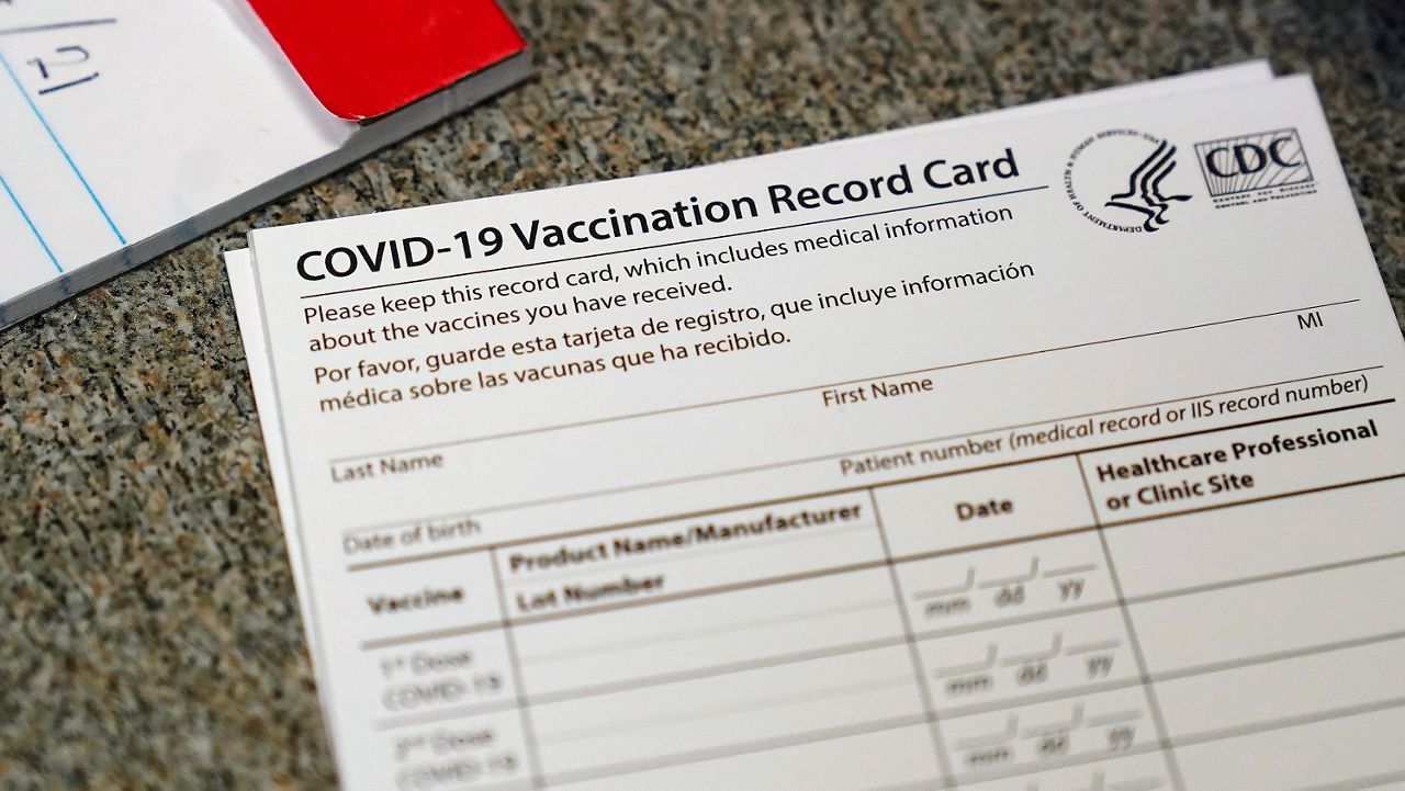
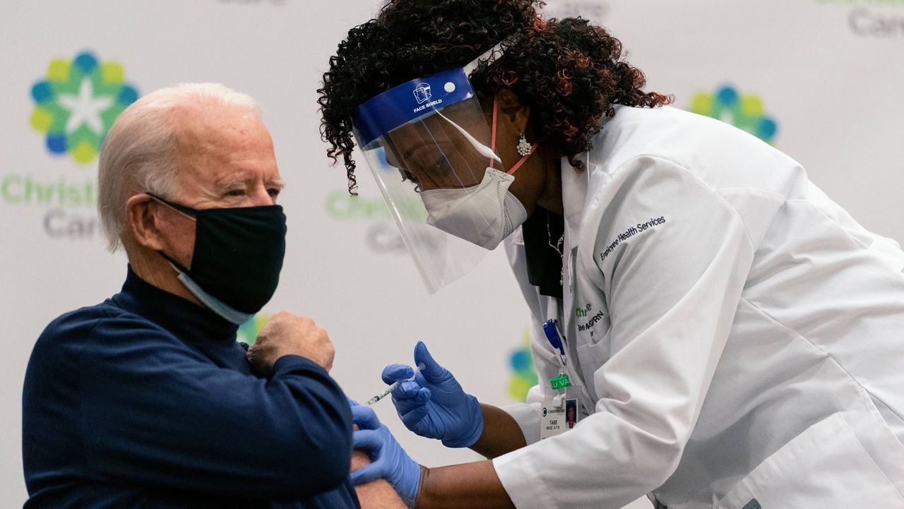
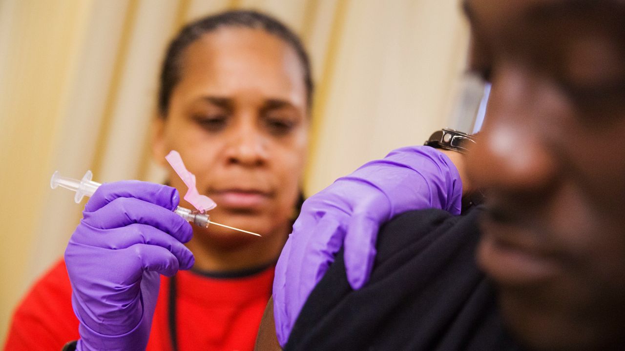
Since the COVID-19 vaccine approvals, CVS Pharmacy in Cary has been putting more of these shots into arms.