


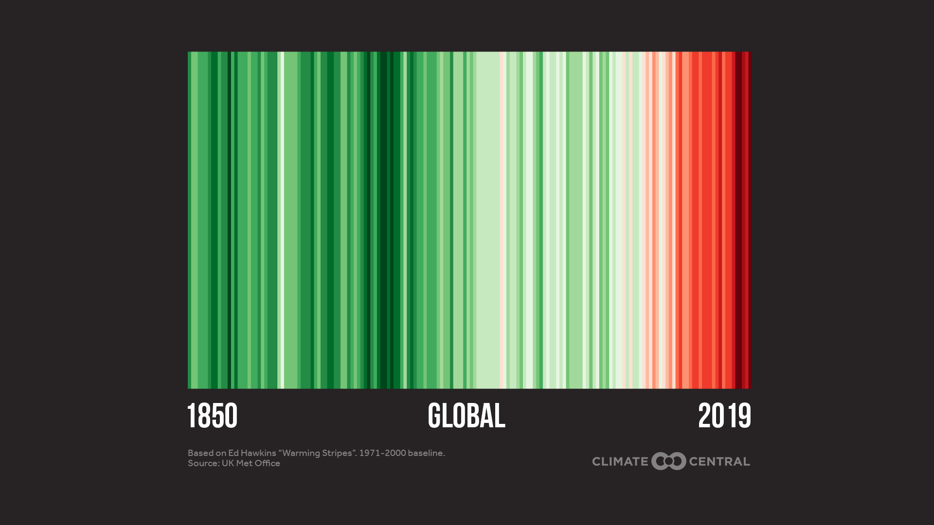
In collaboration with climate scientists, Climate Central scientist Ed Hawkins created the global warming stripes, but with a holiday twist to bring attention to our warming planet this holiday season.
The original global red and blue visual shows the annual temperature differences over the last 170 years from 1850 to 2019, and he also created one for Texas.
With this unique take on the #ShowYourStripes visual campaign, the green stripes represent temperatures lower than average and the bright “Rudolph Red” colors represents temperatures above average.
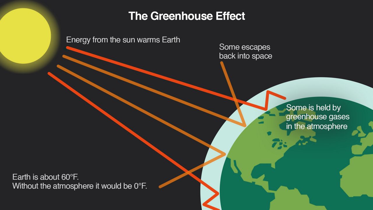
Climate change occurs when excess carbon dioxide and greenhouse gases collect in the atmosphere and then absorb the sunlight that has bounced off the Earth’s surface, trapping it in.
According to NASA, carbon dioxide from human activity is increasing more than 250 times faster than it did from natural sources after the last ice age.
The good news is that we are starting to change our attitudes and becoming more aware of what we are doing to the environment, even in the nation’s top energy-producing state, Texas.
In a study from University of Houston, about 80% of Americans and almost 81% of Texans say they believe climate change is happening. Out of that percentage, most say they are willing to pay more for electricity derived from natural gas produced without venting as well as low-carbon or carbon-neutral transportation fuels and other energy products.
What do you think about this? Follow me on Facebook, Twitter and Instagram to let me know.