We all know what the Subway logo looks like but soon shops will have signs with a different look.
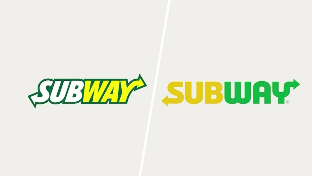
The logo is now yellow and green without the dark border.
A spokesman says the company refreshed it to convey that its food is fresh.
The new colors are meant to reflect the colorful array of fresh vegetables and other ingredients at a Subway shop.
The new insignia is a modified version of its second logo, which was used from the late 1960s until 2002.
The company says its local sub shops will begin carrying more locally-sourced ingredients as part of its "fresh" campaign.