


Around this time last year you may have seen images like this circling around social media, especially if you follow a meteorologist on Facebook or Twitter. You may have also noticed your favorite TV meteorologist wearing a tie, socks or necklace that looked like this. Beyond being a pretty cool looking picture on its own, this image tells an important story.
This Friday is not only the first day of summer, but is also #ShowYourStripes Day. Climate scientist Ed Hawkins created the blue to red image above to visualize the warming our planet has been going through. While there are many sources of information that provide more specific details on how temperatures have changed, these graphics were intentionally designed to be as simple as possible to spark conversations about our warming world and the effects of climate change.
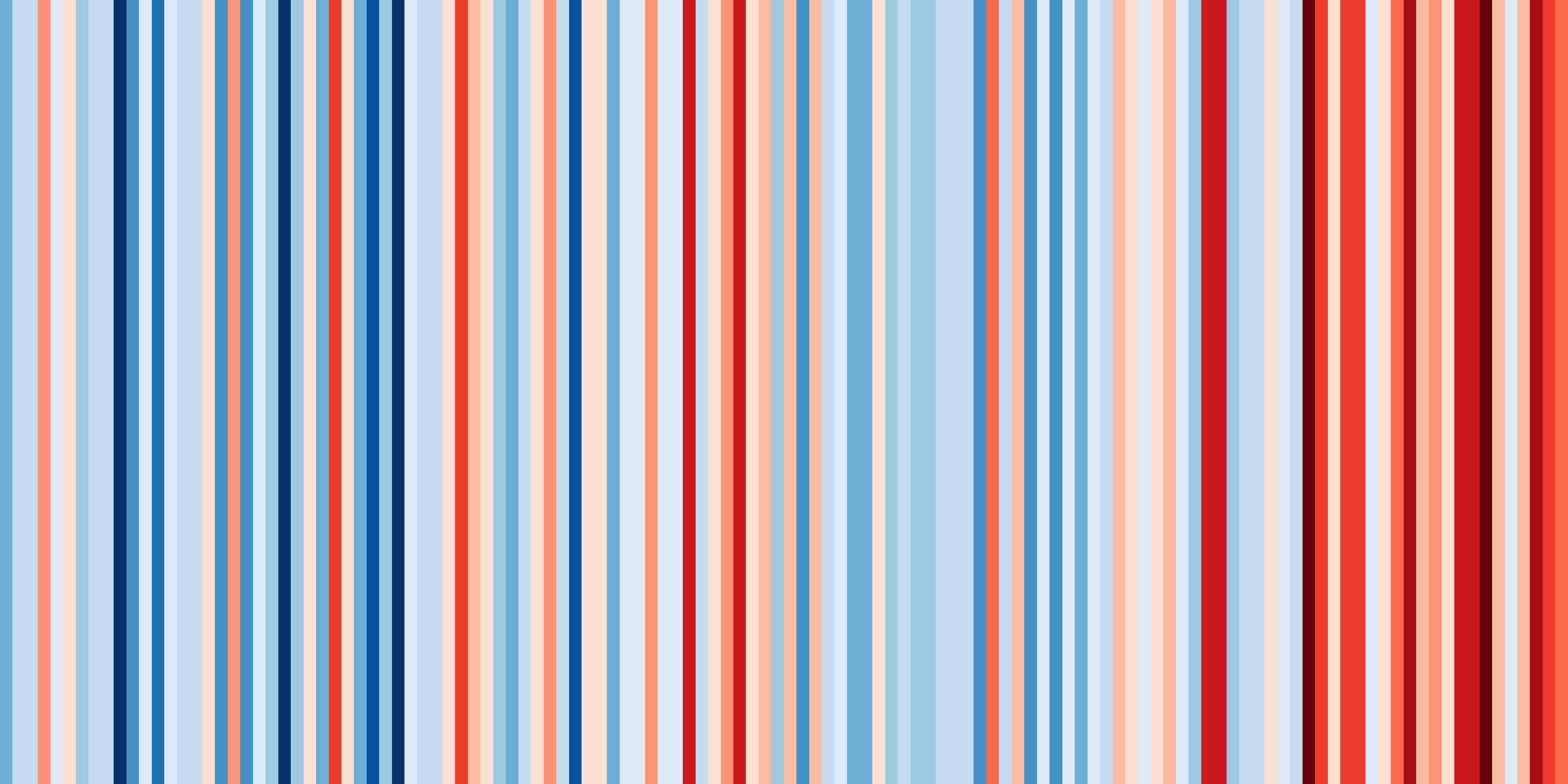
Above is the visual of New York’s average annual temperatures from 1895-2018.
This year you can also see US city by city visuals, along with International visuals. Get more info on how you can #ShowYourStripes this Friday.